Accessibility and aesthetics: Rebuilding Truckee Sanitary District’s website

The client
Truckee Sanitary District is a California special district responsible for sewer service in the Truckee-North Tahoe region. Like many public agencies, their website needs to serve a broad public audience — residents, contractors, and local government stakeholders — clearly and reliably.
The challenge
The district’s existing site had aged out of step with how their users navigate the web. Navigation was difficult to parse, accessibility was difficult to achieve for site editors, and the site performed poorly on mobile devices. These were gaps for a public-facing agency.
There was also a less obvious challenge: making the redesigned site genuinely accessible without sacrificing visual quality. For public agencies, accessibility is both a legal consideration and a service obligation. However, accessible design is too often treated as a constraint rather than a design goal.
Project snapshot
Before and after
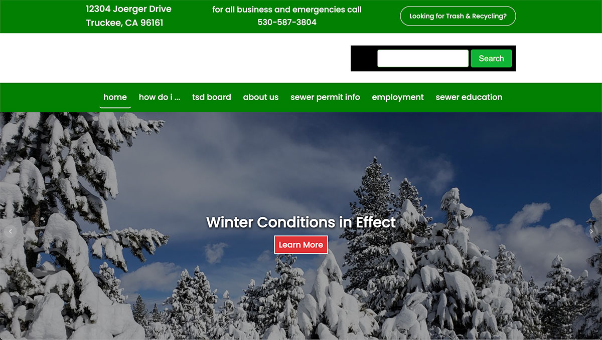
Old Truckee Sanitary District desktop view
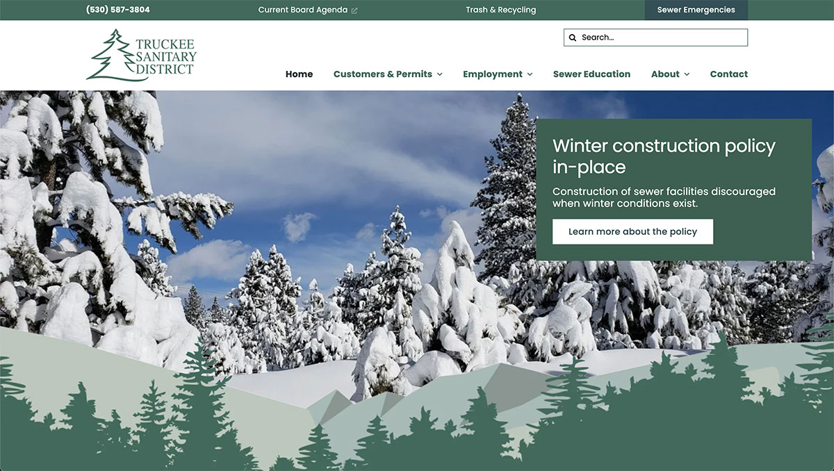
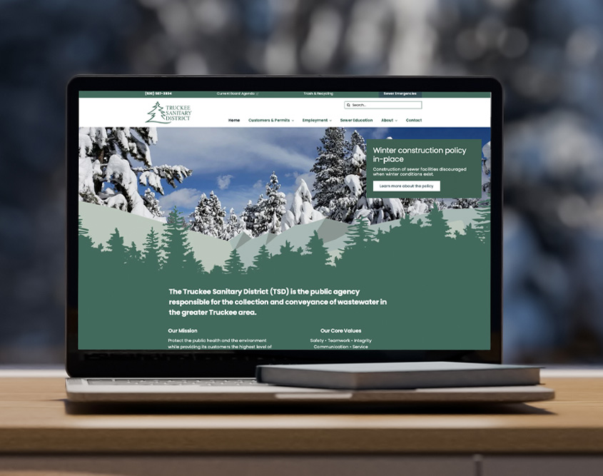
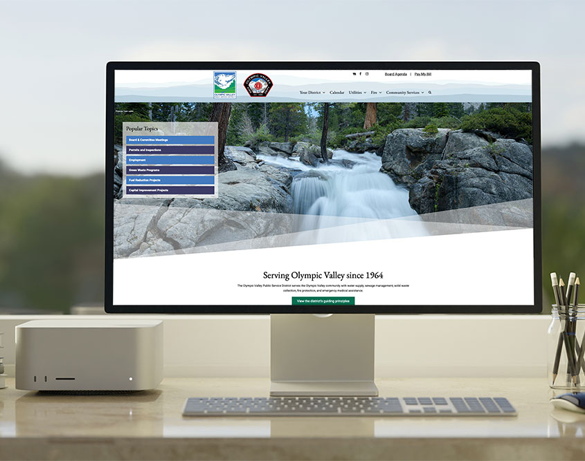
New Truckee Sanitary District desktop view
The process
Before any design work began, we conducted a structured discovery phase. We interviewed Truckee Sanitary District staff to understand how their users interact with the site: what they come looking for, where they get stuck, and what the agency most needs to communicate. We paired those conversations with a review of the site’s existing analytics to identify user behavior patterns.
That research shaped everything that followed:
Information architecture
The site’s navigation and page structure were rebuilt from scratch based on what we learned. Pages were reorganized around user intent rather than internal agency structure, a distinction that matters more than most clients initially expect.
Visual redesign
The visual system was designed to reflect the district’s role as a professional public institution while remaining approachable and easy to read. Clean typography, a structured layout, and a restrained color palette replaced the dated aesthetic of the original site.
Accessibility
WCAG AA compliance was a primary goal from the start, not a checklist item at the end. We implemented accessibility enhancements built on top of the WordPress theme we have refined specifically for public agency work. These customizations cover contrast ratios, focus states, heading hierarchy, alt text standards, menu functionality, and mobile interaction patterns.

The result
The redesigned truckeesan.org is faster, more navigable, and significantly more accessible than its predecessor. It performs well on mobile and desktop, makes big leaps toward WCAG AA standards, and gives the district a web presence that reflects the quality of the institution it represents.
Alpen Lily Web Studio: Public agency website experts
Alpen Lily Web Studio works with special districts and public agencies across California. We understand the unique requirements of public-facing websites: accessibility compliance, broad audience needs, limited budgets, and the obligation to serve the community clearly and well.
If your agency’s site is overdue for a rethink, we’d be glad to talk.